Opening a gourmet pizzeria in Ciudad del Carmen meant competing against 200 established restaurants with a limited budget and zero brand recognition. Madre Fuego needed to cut through the noise immediately, or disappear into it.
Brand Strategy, Brand Identity, Brand Collateral
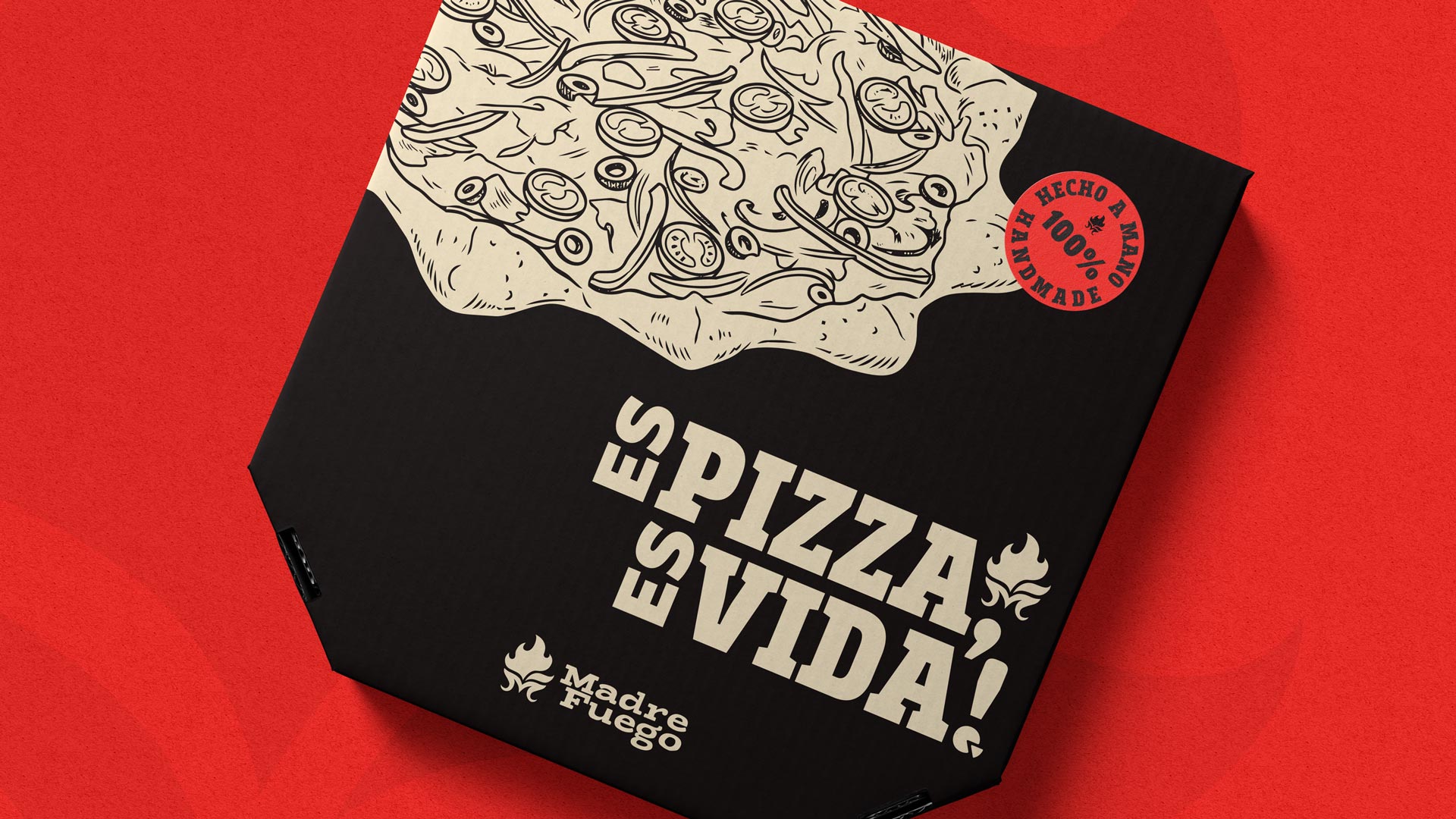
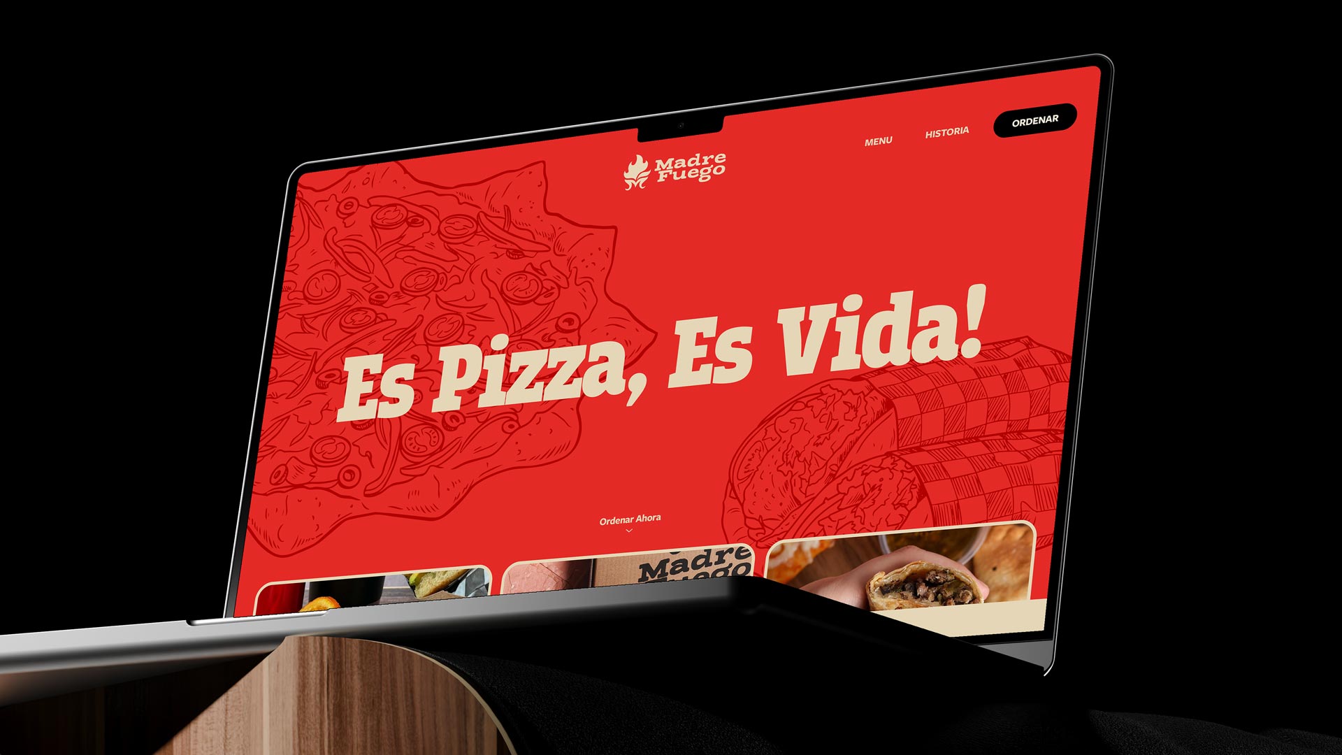
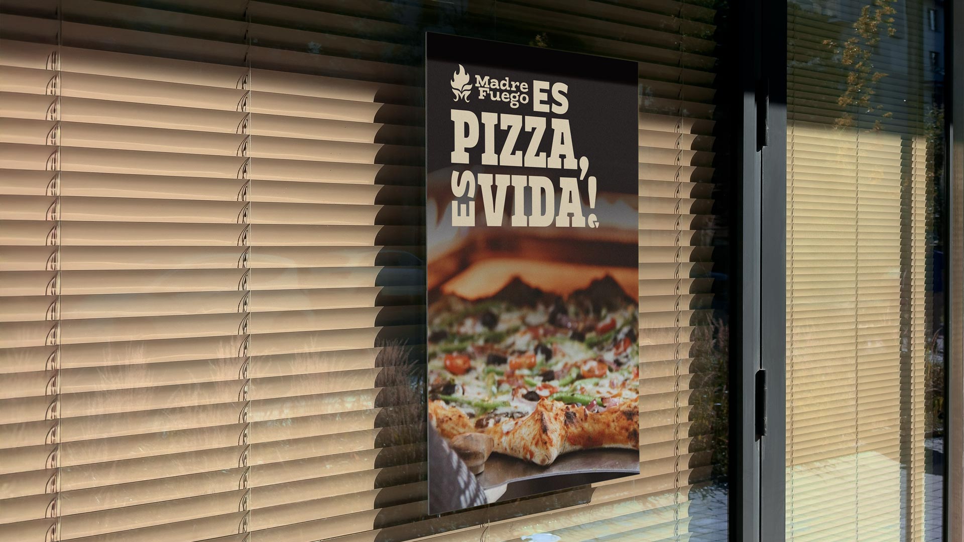
The visual identity needed to reflect the product—bold, unexpected, impossible to forget. We built a color system with black and red as the foundation, supported by warm neutrals that created a moody, high-end feel without pretension. The palette stopped scrolls and turned heads. The brandmark tells Madre Fuego's story in abstract form. The letter 'M' sits at the bottom of a flame representing the oven. Pointy corners reference the signature stuffed crust. The "jumping flame" on the right represents separation from the crowd—and combines with the M below to create an abstract 'F'.
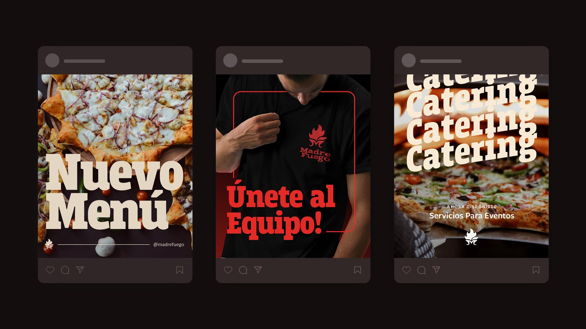
Every element has meaning. Nothing is decorative. The logo's flexibility mattered as much as its impact. One color, any background, works everywhere. Embroidered on aprons. Printed on boxes. Stamped on social graphics. A startup budget couldn't limit what the brand could do. We designed the launch collateral—packaging, uniforms, merchandise, digital assets—to create a cohesive presence from day one. The brand didn't whisper "we're new." It announced "we're here."


How does a new pizzeria convince customers to skip their usual order? By becoming impossible to ignore. Madre Fuego had the product—artisan dough, genuine ingredients, and a unique cream cheese-stuffed crust that people actually finish. What they lacked was a brand that communicated why any of that mattered to customers drowning in pizza options.
The vision was clear: make great, healthy pizza available for everyone. Not premium-priced. Not exclusive. Just quality food at prices that work for real people.
We started with strategy, not aesthetics. Through competitive analysis and customer interviews, we identified the gap Madre Fuego could own: gourmet quality without the premium markup. Millennials wanted better pizza but couldn't justify driving across town or paying high-end prices. Fast-food chains were convenient but felt like a compromise. Madre Fuego became the answer.


Madre Fuego attracted exactly who they targeted: millennials and families who care about quality and pay for value. The bold identity made them instantly recognizable in a crowded market. But the brand delivered beyond customer acquisition. Quality employees wanted to work there. Hiring became easier. A major bakery in Ciudad del Carmen reached out to a partner. Other businesses wanted association with the brand.
Today, Madre Fuego operates multiple locations with expanded product lines and a loyal customer base. The pizzeria that started with limited resources in a saturated market now stands as proof that clear strategy and confident execution win over bigger budgets.


"We were facing a very competitive market—with a moderate-sized budget—so we knew we had to hire someone to help us represent our brand in the best light possible. We knew our strengths, values and vision, so we decided to hire E49 to help bring these concepts to life with a new logo. When we talked with the E49 team, we felt understood and guided. Before we started the design process, we discussed our business model and vision, which made everything easier for us.
A few months after implementing the new logo—and some hard work—we kept attracting the right clientele, employees and even partnerships. We are confident this happened because of our collaboration with E49 and their proven process of designing a brand's identity." — Fabian Monroy, Owner & Head Chef


